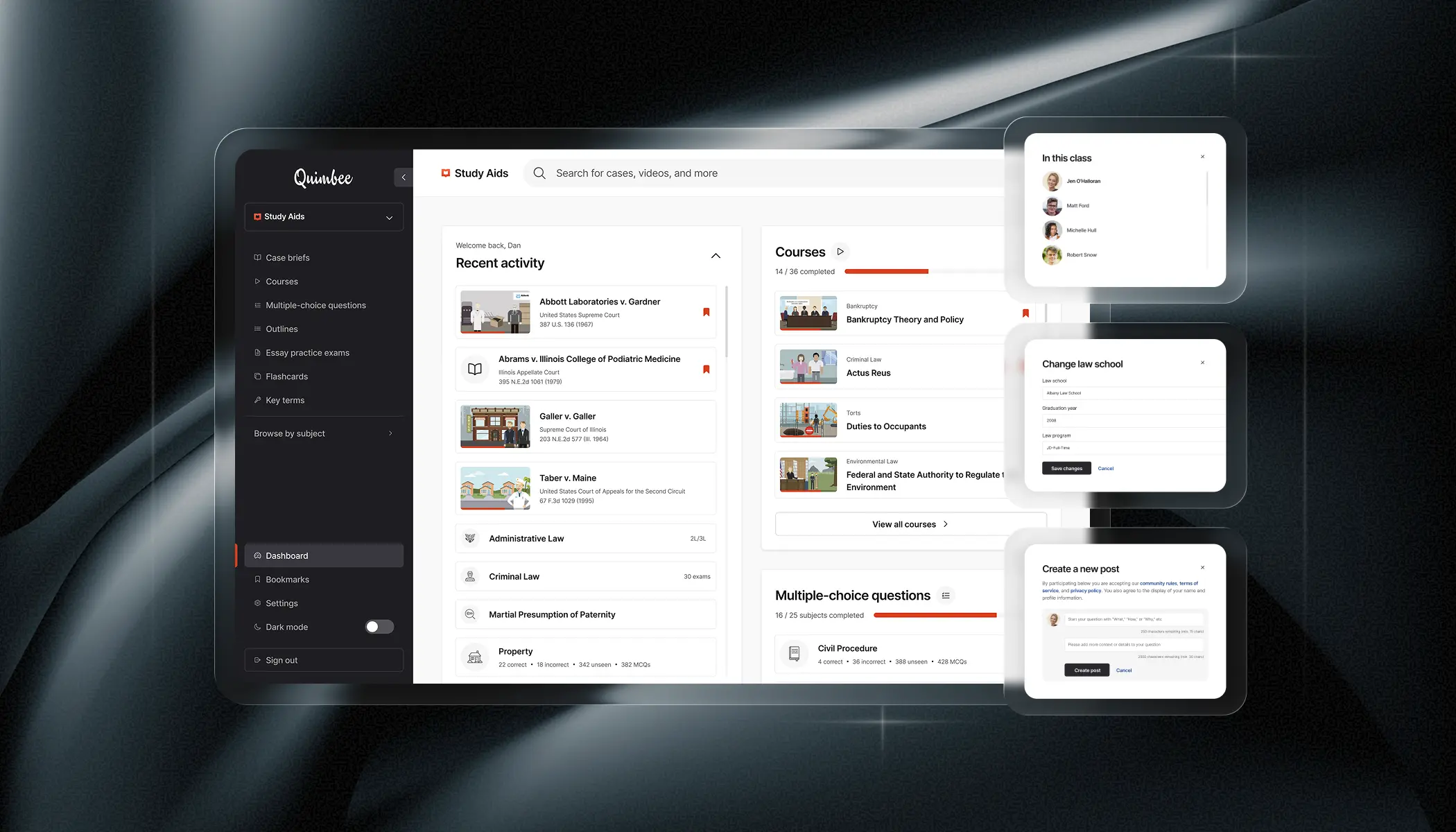
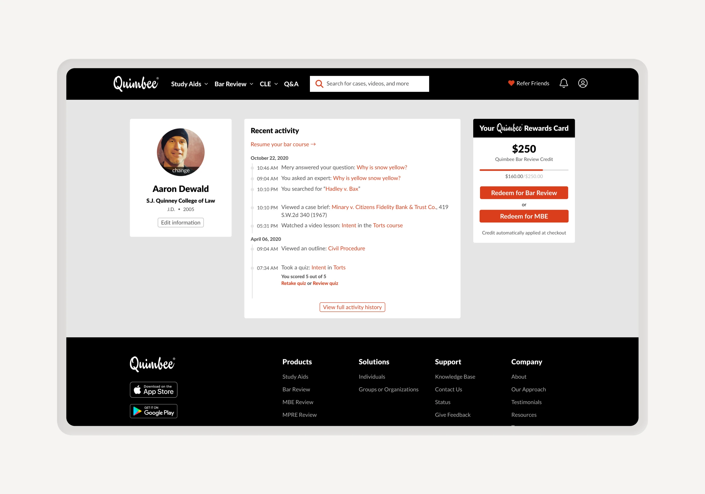
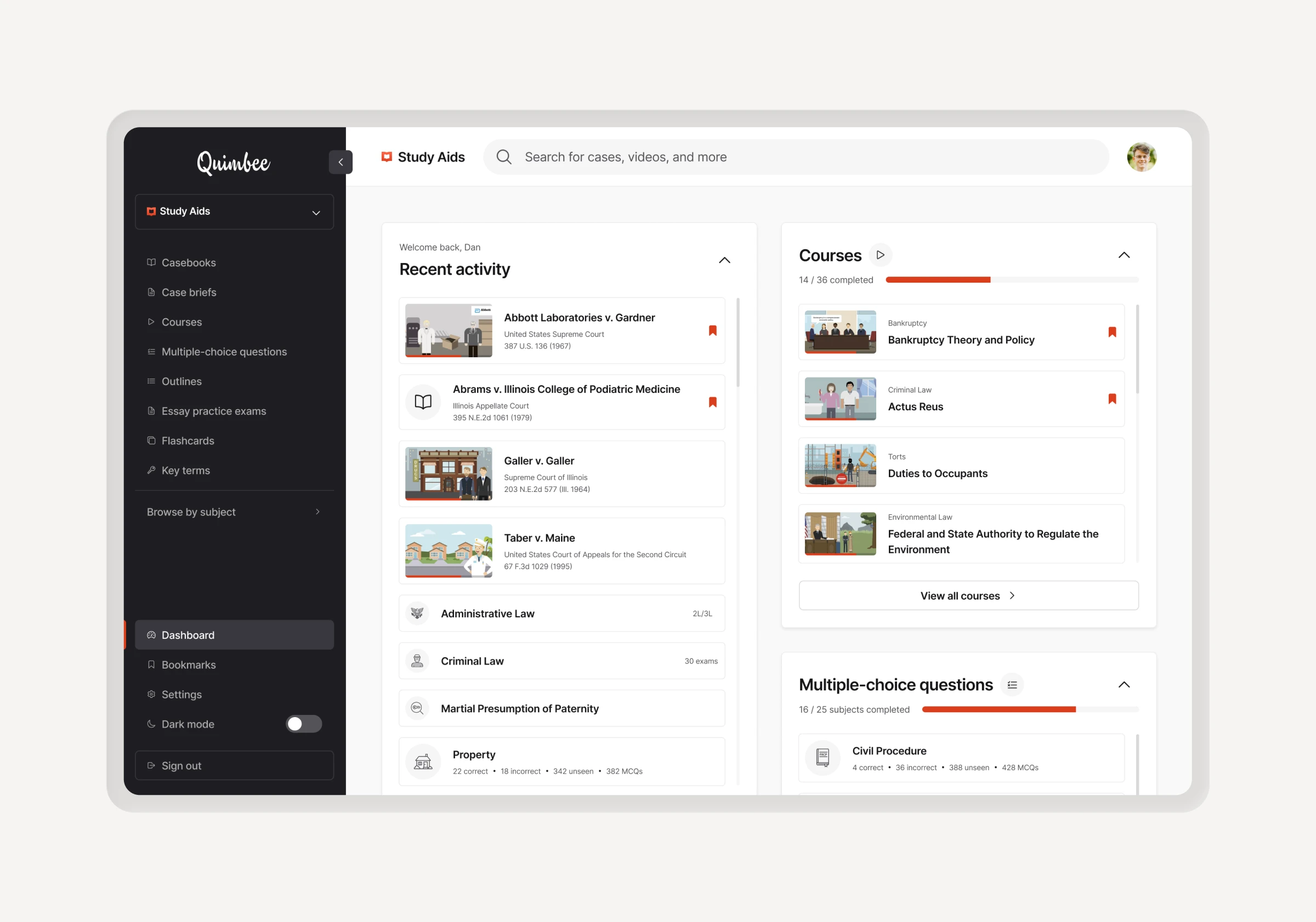
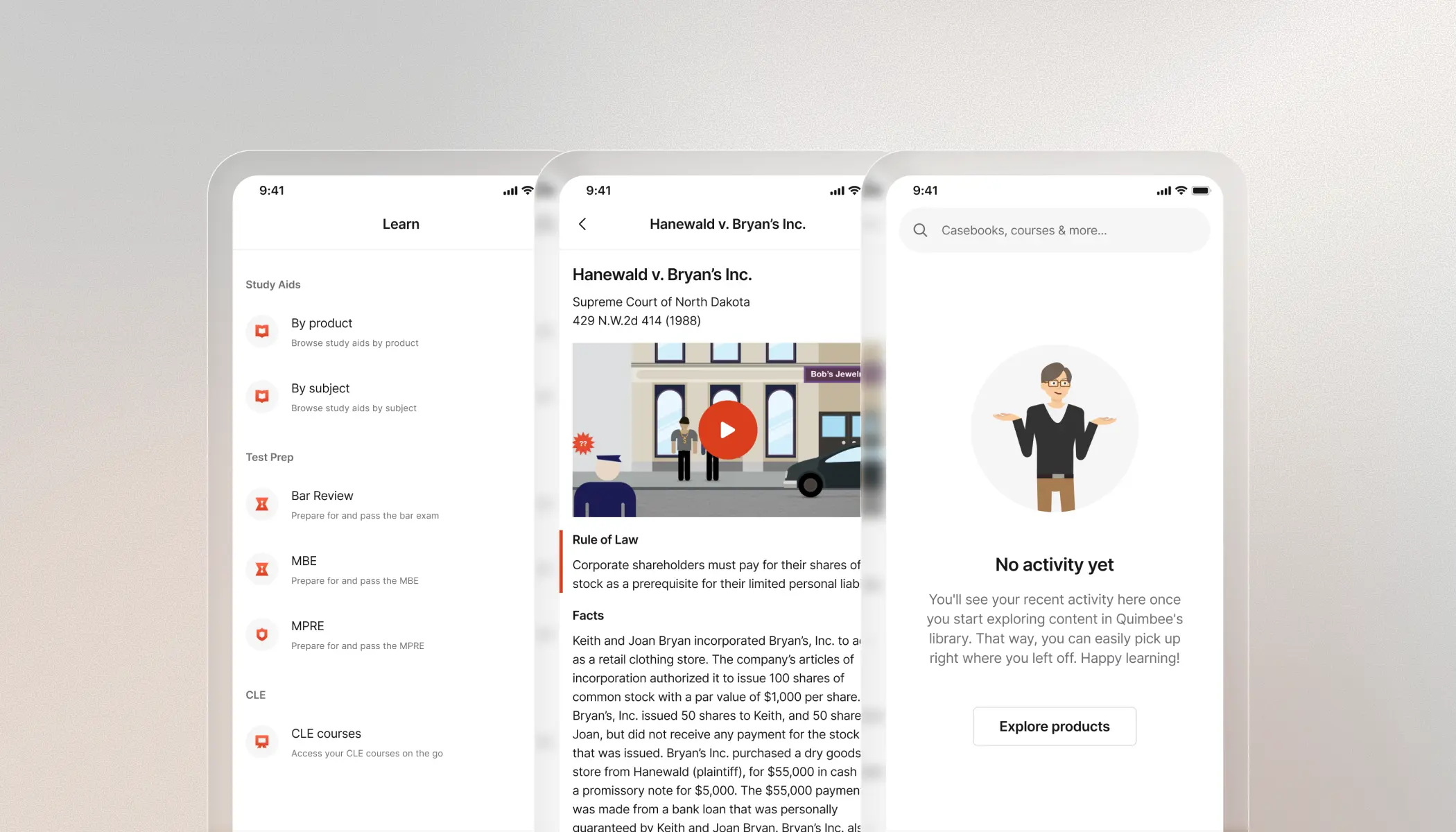
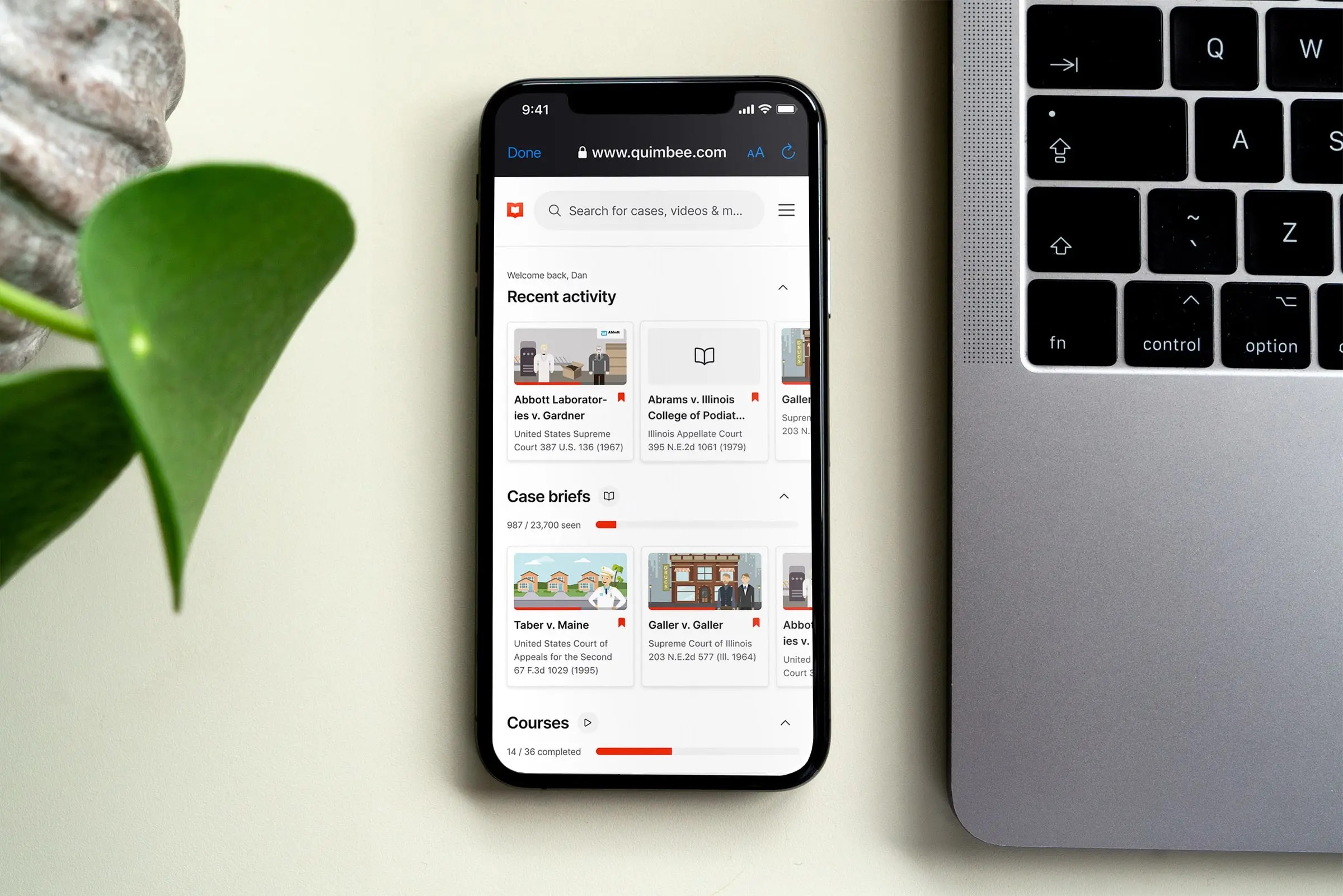
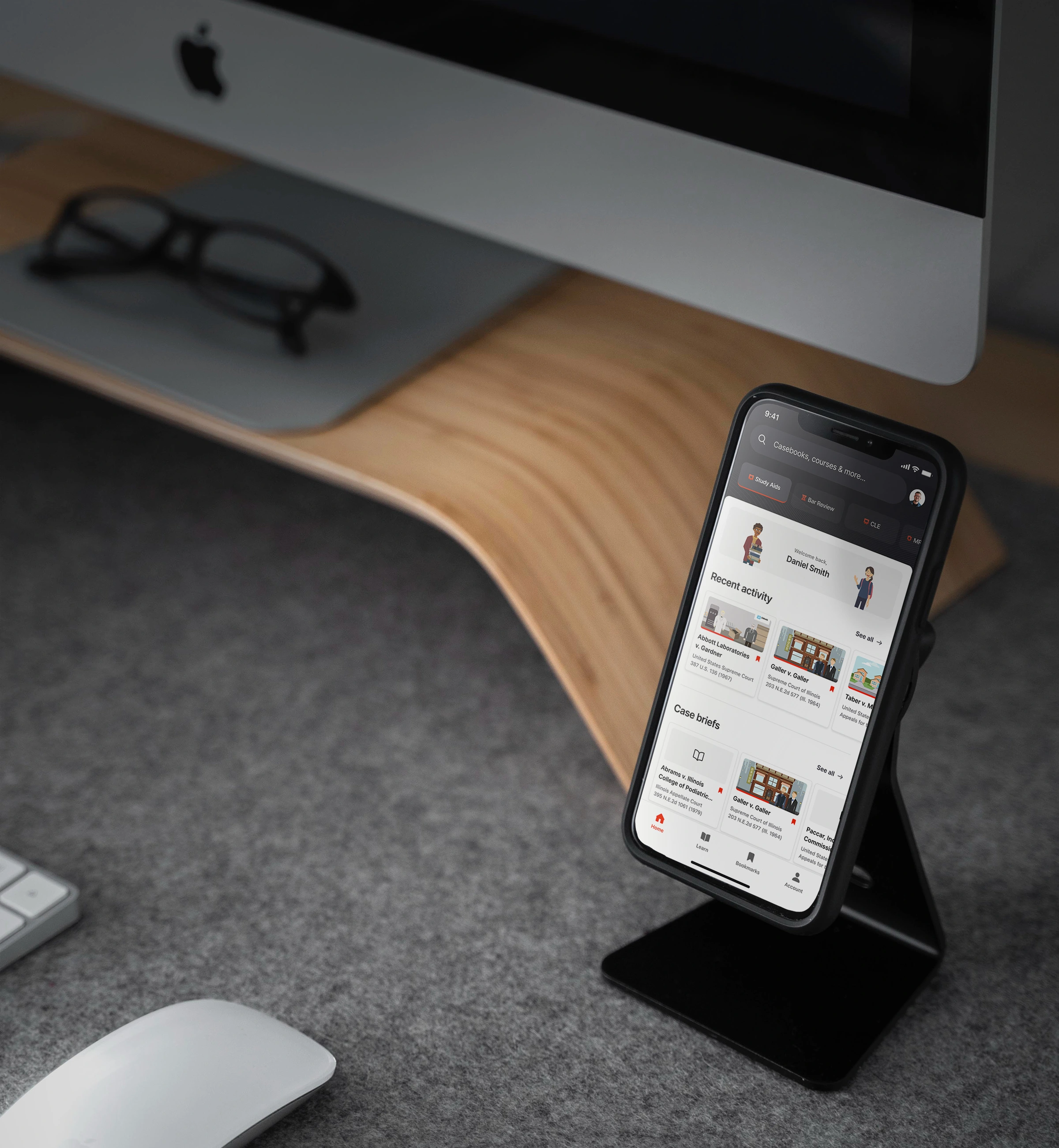
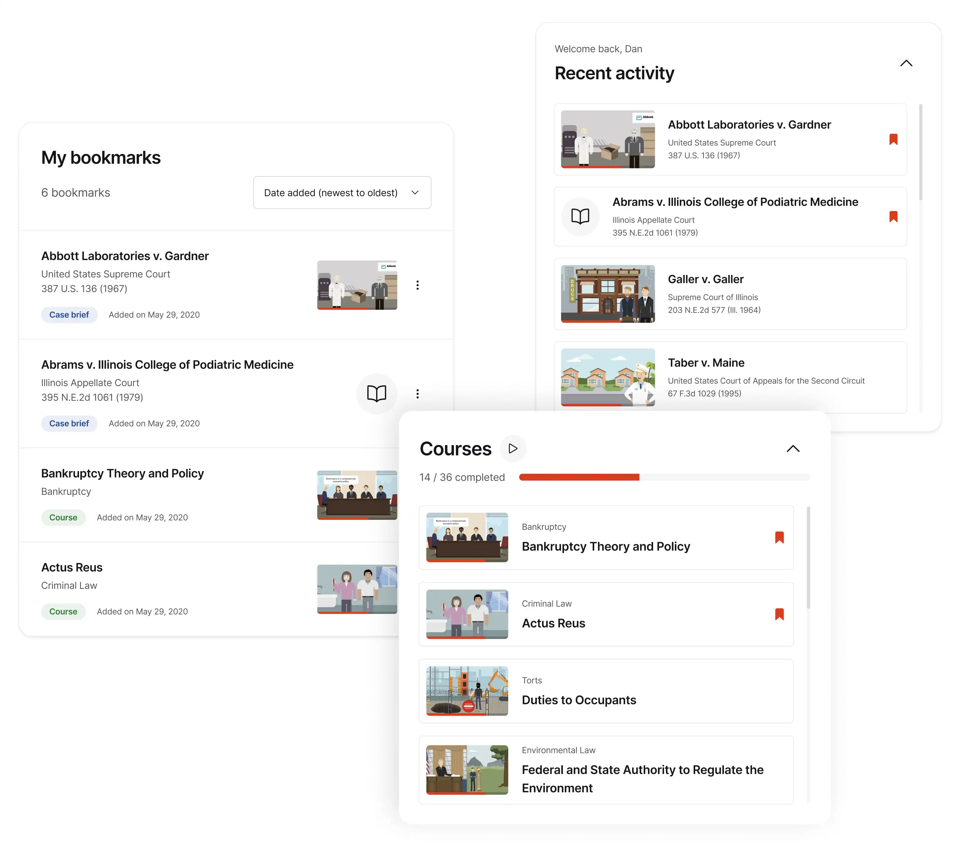
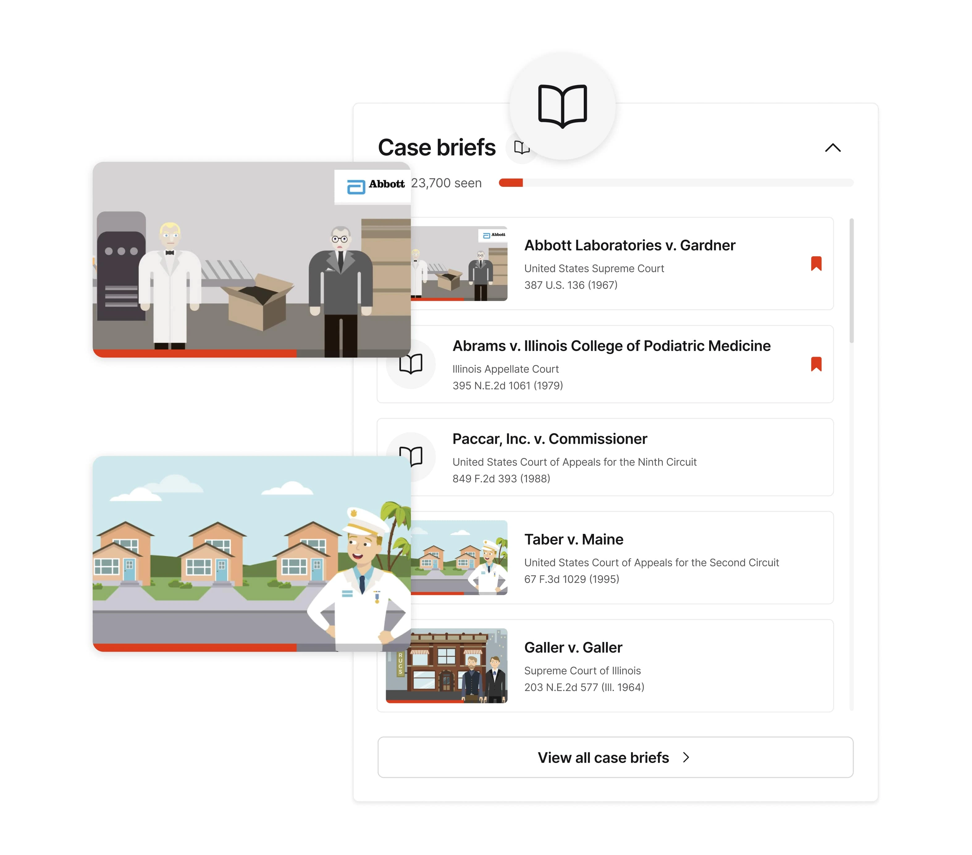
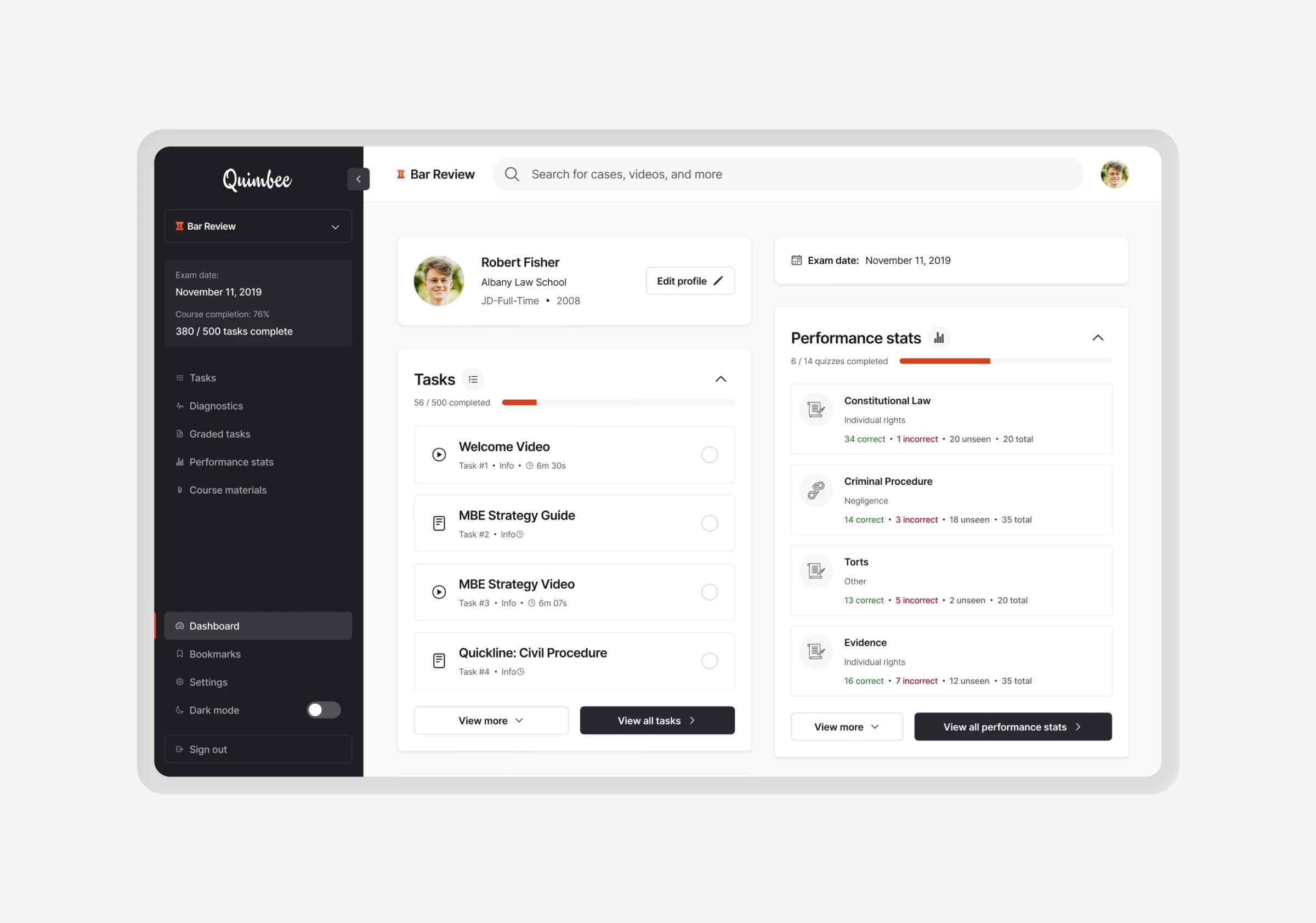
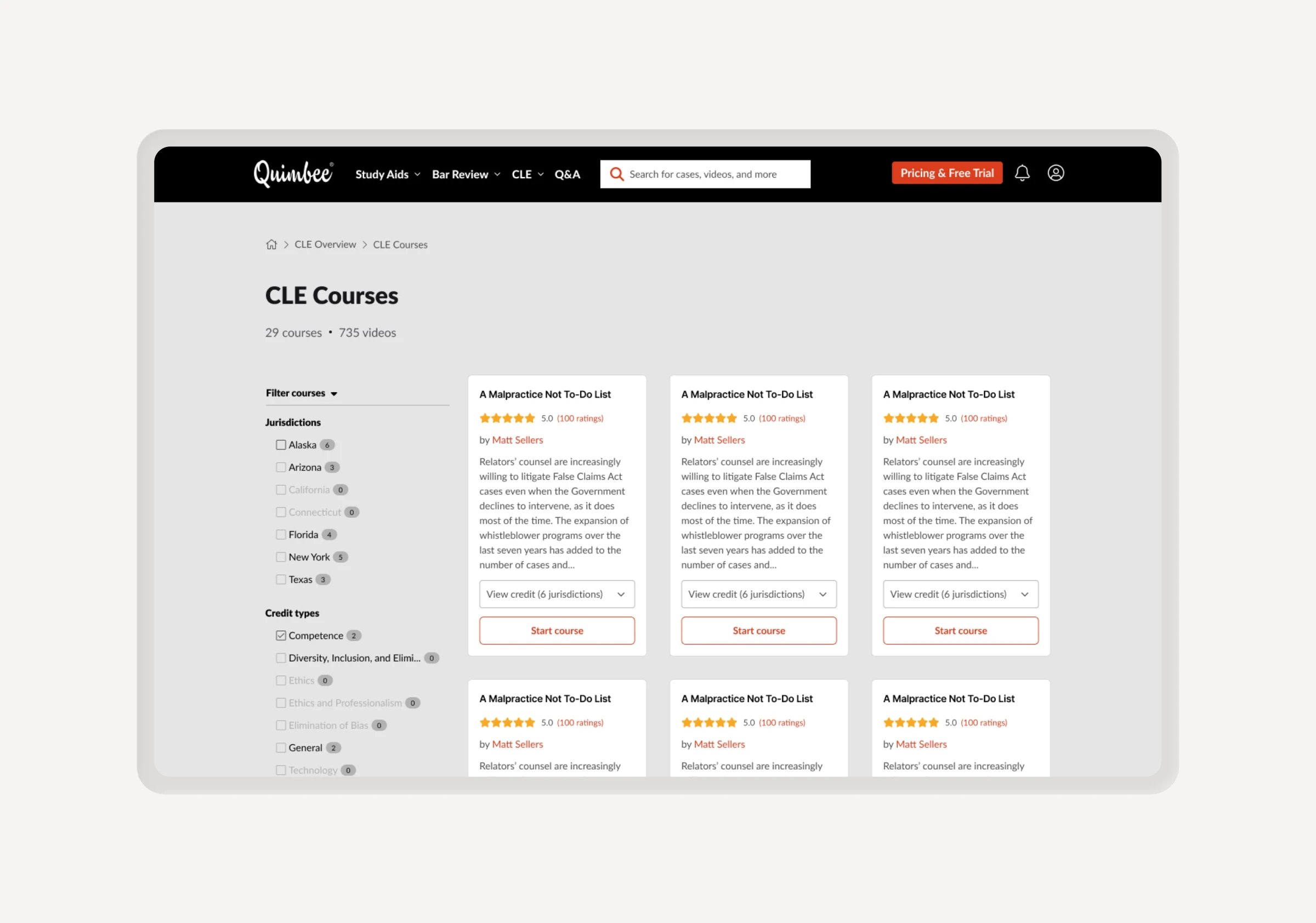
I elevated core learning and assessment products, improving NPS empowering the next generation of top-tier legal talent.

Empowering the next generation of legal professionals.

Overview

TLDR

Quimbee’s flagship Study Aids platform suffered from an outdated user experience, resulting in low satisfaction scores and poor visibility for newer product lines like Bar Review and CLE. I led a comprehensive redesign of the student dashboard, introducing intuitive organizational tools and a personalized content management system.

We transformed the user experience, achieving a 30% increase in NPS and a 30-point jump in CSAT (62% to 92%). Beyond the metrics, we successfully integrated high-demand features like bookmarking and advanced search while significantly improving cross-product discoverability.

BeforeAfter

The problem

Defining the problems

  1. Low NPS (34/100)
  2. High feature demand
  3. Clunky UX
  4. Low CSAT (62%)
Project image

Process

Adjusting the process

Given the critical nature of the Study Aids dashboard, I opted to deviate from our standard high-fidelity workflow. By utilizing a low-fidelity exploration phase, we were able to avoid sweating the details and test multiple structural solutions, ensuring the final direction met expectations for our users' workflows.

Project image

Research

Identifying friction

To ensure our design decisions were rooted in real-world utility, I led a research initiative involving 400+ active Quimbee users. We categorized qualitative feedback into key themes to define what students actually needed to stay organized and productive.

By pairing these insights with quantitative heatmap data, we mapped out the existing dashboard’s friction points, allowing us to focus our efforts on the most impactful structural changes.

Project imageProject image

Learnings

Key takeaways

Our key takeaways from the initial user research and page breakdown gave us valuable insight into what areas we should focus on and what would satisfy our users.

Project imageProject image

UX architecture

Exploring user flows

Our goal was to create a dashboard that felt both organized and easy to use. I prioritized the tools students use every day, while making the rest of the platform easy to explore through simple navigation.

At the same time, we made sure our other products - like Bar Review and CLE - were easy to find. This helped more users discover the full range of what Quimbee offers, leading to higher engagement and more sign-ups.

We prototyped four initial concepts based on our user research. After reviewing them with stakeholders, we narrowed the focus to two final directions (Concepts C & D) for high-fidelity user testing.

Project image

Usability testing

Battle of the nav

I used Figma to test two competing navigation styles with users. While stakeholders favored an accordion menu that exposed all products, the design team advocated for a cleaner dropdown to minimize distractions. By analyzing verbal and visual feedback during testing, I was able to identify which approach truly met user needs and where the friction points remained.

Concept CConcept D

User feedback

Analysis

Users overwhelmingly preferred the dropdown concept, which validated our decision from a design standpoint. Feedback general pointed out that the accordion-style menu felt cluttered and not useful. Users also told us that the content section was a huge improvement and would help them organize and personalize their experience.

Project imageProject image

The final design

Study Aids Dashboard

Utilizing icons, color and video thumbnails gives users an improved visual hierarchy, making it faster to scan and locate content. It also makes the dashboard more generally appealing. Giving users the ability to pin/bookmark content allows users to customize their content layout. By adding content specific panels we improved the default dashboard organization.

Project image
Project imageProject image

Outcomes

Results & expansion

Metrics improved across the board following the launch. We saw an increase from 62% to 92% in CSAT, a stat sig improvement to NPS from 34 to 67, and positive sentiment on social and app store reviews.

The success of the redesign led to a full-scale rollout of the new sidebar across all internal content pages and the creation of specialized dashboards for our three main product lines: Study Aids, Bar Review, and CLE.

This new architecture allowed us to tailor the experience to the unique needs of each user group. Based on the positive results from the web platform, we also expanded this UX to the iOS app, ensuring a consistent and seamless experience for students across all their devices.

BeforeAfter
BeforeAfter
Project image

Credits

Product Design, User Research

Dan Wood

Engineering

María Pérez Ferrando, Derek Kniffin

Product Management

Aaron Dewald

Preview

Next Project

Simply Nootropics