
Case Study: Current Information Architecture
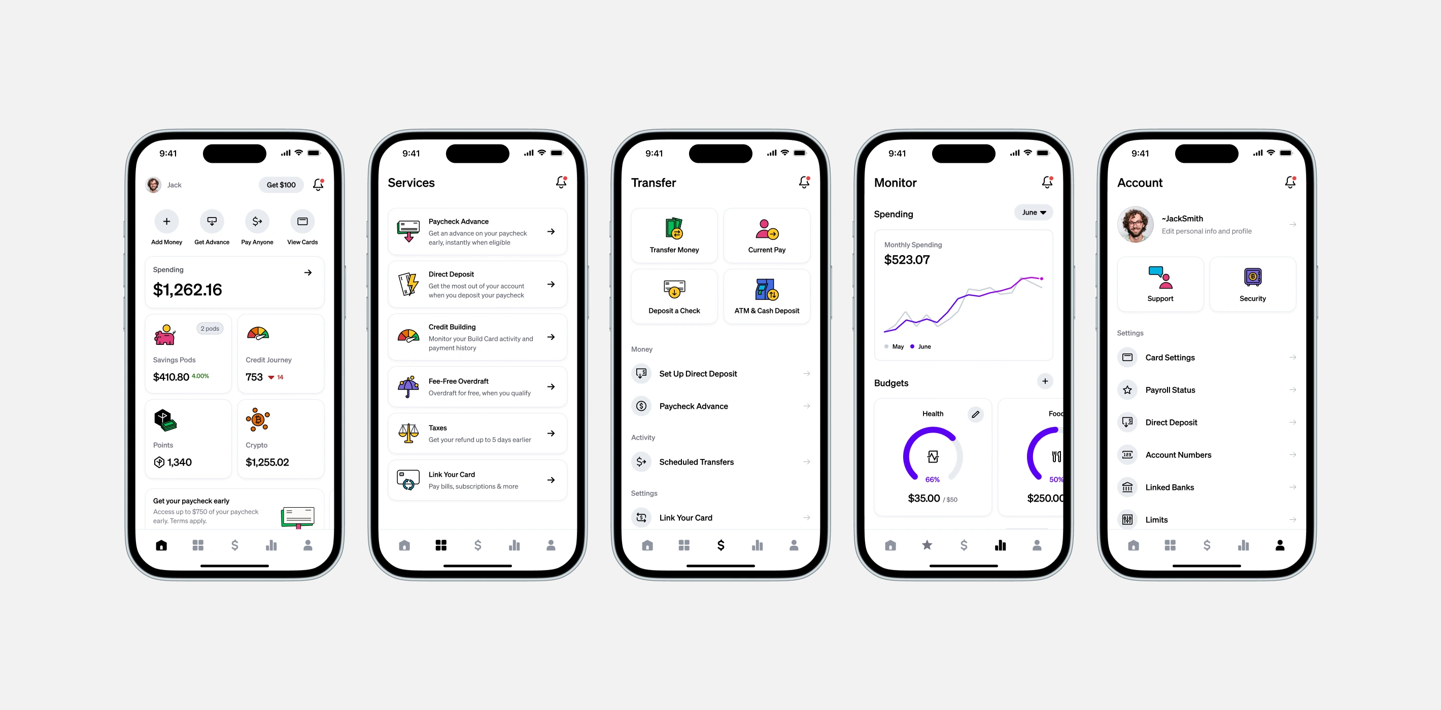
As Current expanded and added new products, offers, and incentives, our original five-tab navigation began to work against us. Key features were buried in secondary tabs, reward campaigns and partner offers were all displayed in the same place competing for attention, and duplicate entry points made navigation and discovery feel cluttered and confusing for our users.
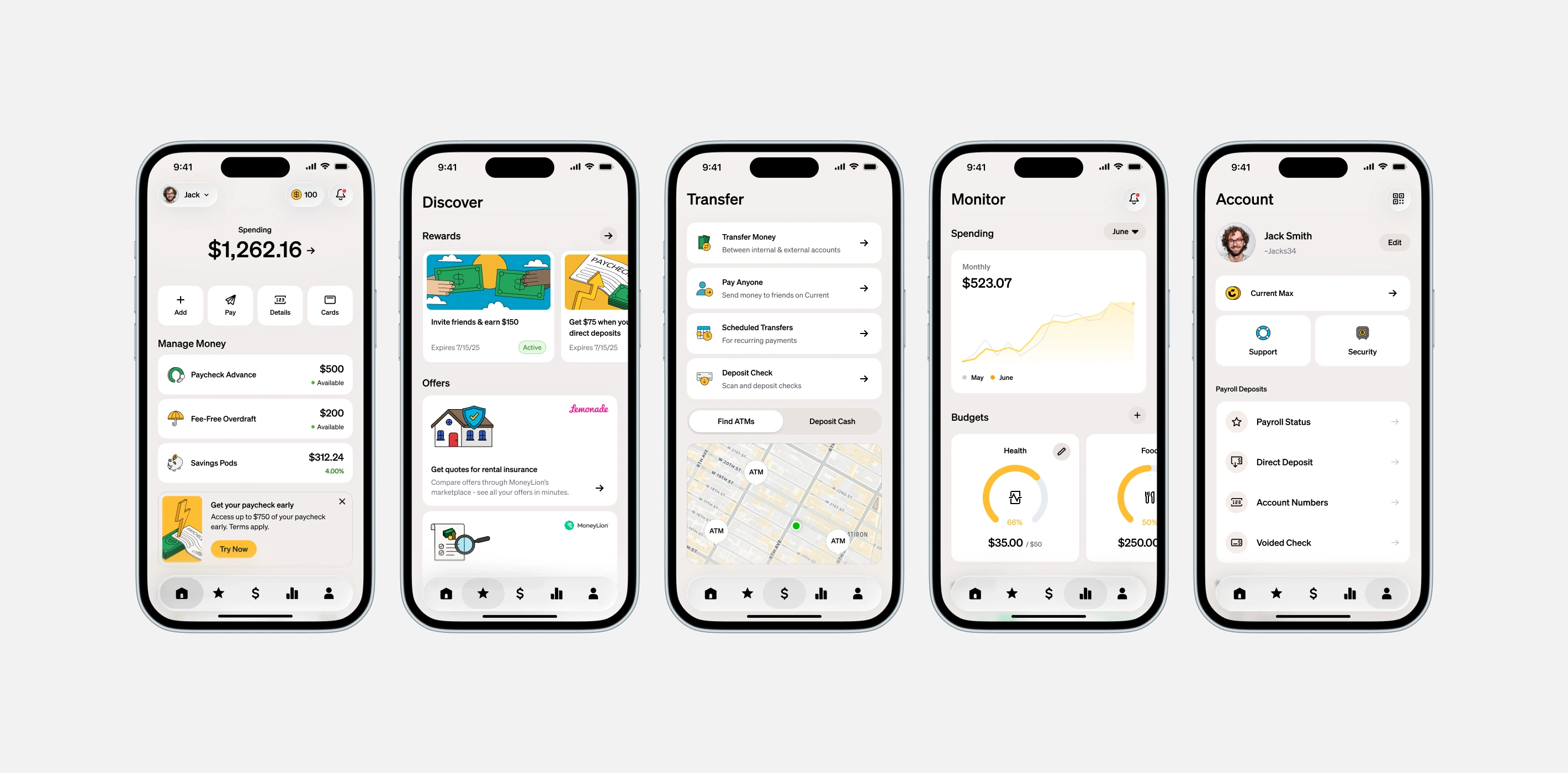
To fix this, we redesigned the information architecture to be much more intuitive. We deprecated a 'junk drawer' tab and found logical homes for features, with the goal of meeting business goals and user needs for a simple, streamlined financial experience.
The problem
Buried treasure
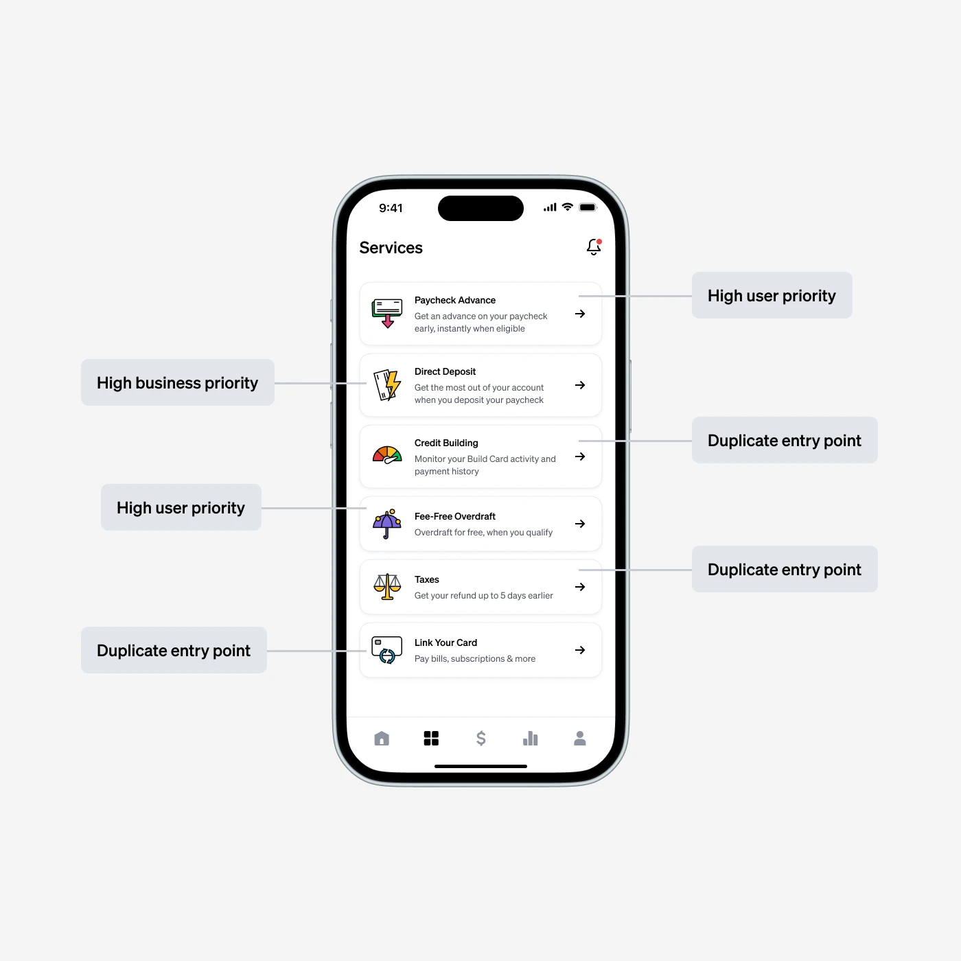
Through research and marketing data, we knew over 70% of new users were joining Current for liquidity reasons. Our most impactful liquidity features - Paycheck Advance and Overdraft - were buried in a secondary tab, limiting adoption, visibility, and consecutive useage.
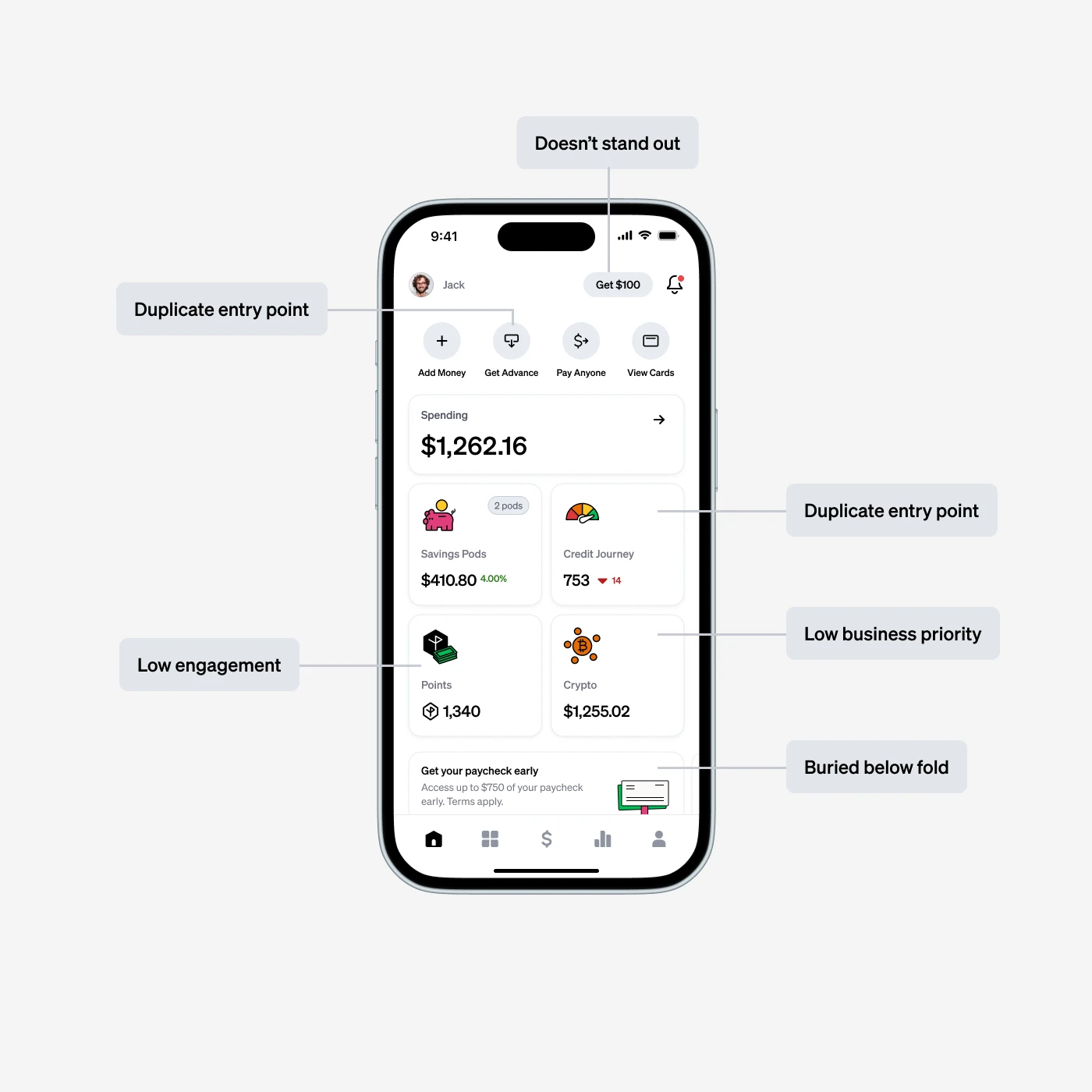
To make matters worse, over time as new features were added and old design structures were abandonded, entrypoints to the same features were scattered throughout the 5 primary tabs and beyond, adding unnessecary cognitive load.
The problem
Information overload
With promotional offers and partnerships, we were limited to using interstitials and content cards on the overview screen, in the same space we were communicating other account related info. PMs and other stakeholders were battling for space as our need to communicate important information and offers grew. This also made for a frustrating user experience, where offers shown in app were fleeting, with no easy way to rediscover.
User research
So what makes sense to our users?
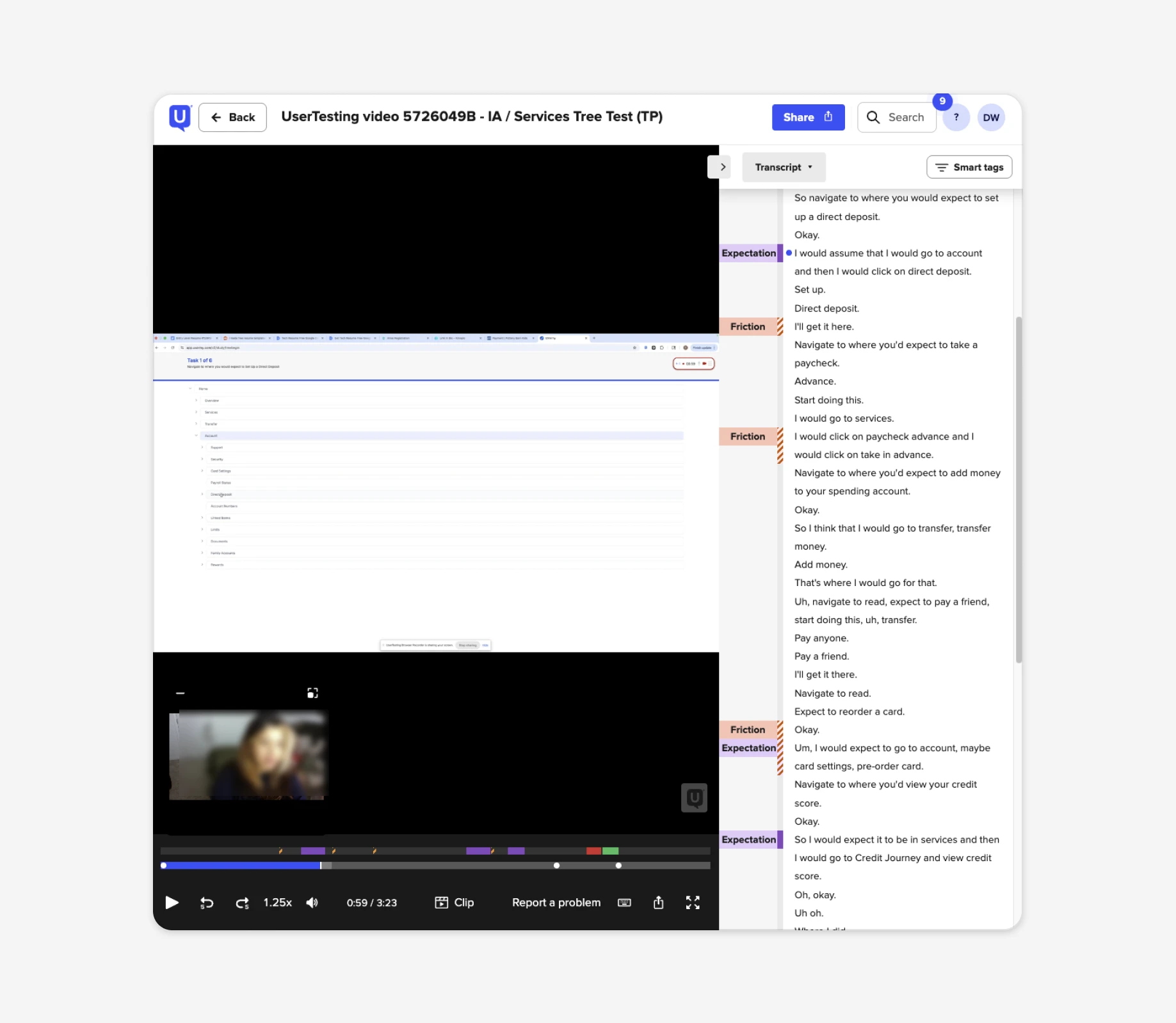
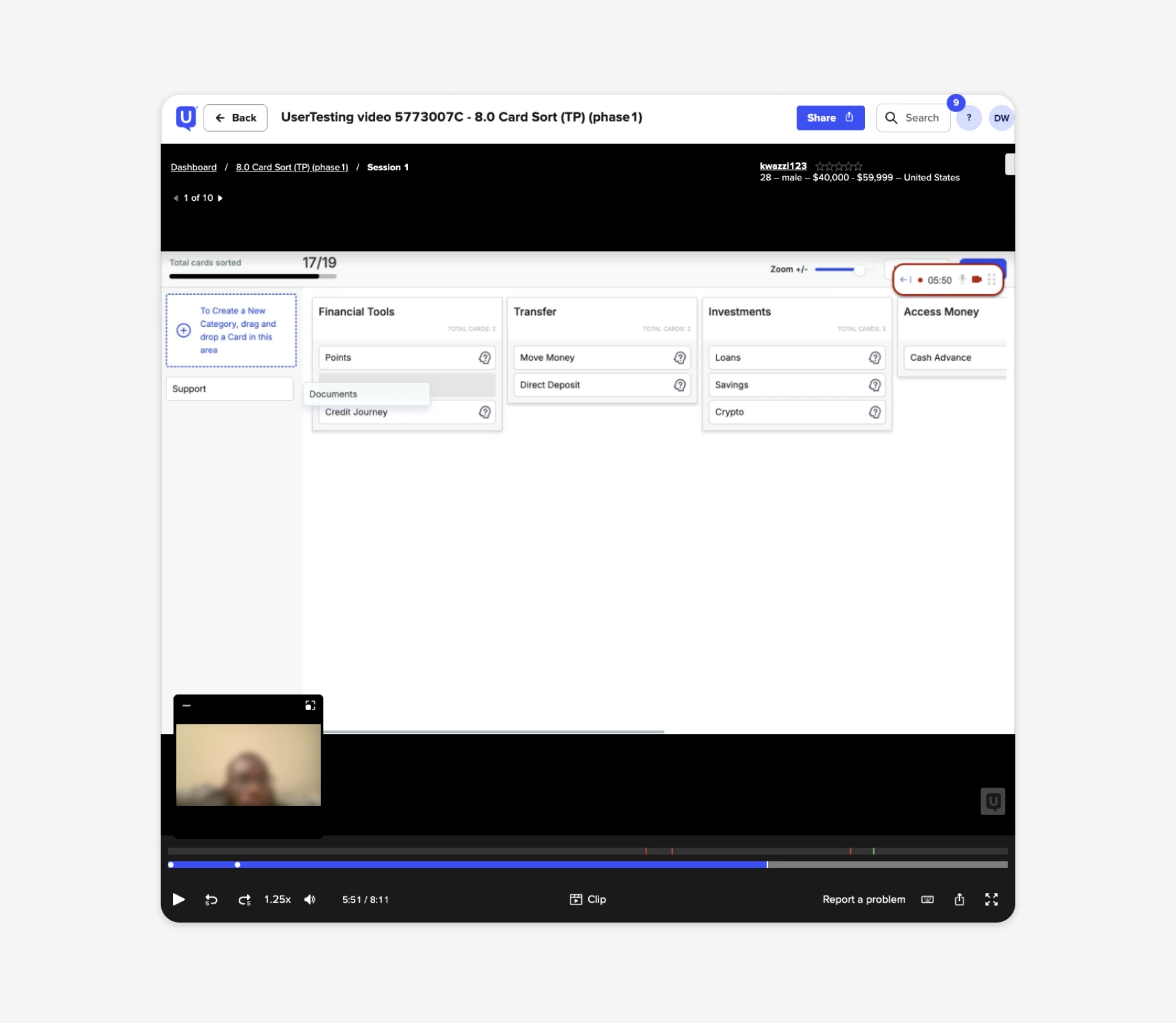
Our original navigation structure relied on outdated logic that split key features across five different tabs. Over time, as we added new services, this led to redundant entry points and a fragmented user experience.
To resolve this, we conducted tree testing and card sorting to validate a new approach. The results confirmed that consolidating these paths into single, focused entry points significantly improved navigation and removed unnecessary complexity.
Strategy
The way forward
By removing duplicate entry points, deprecating the "Services" tab, and moving prominent features directly to the "Overview" tab, we could significantly increase discoverability and engagement.
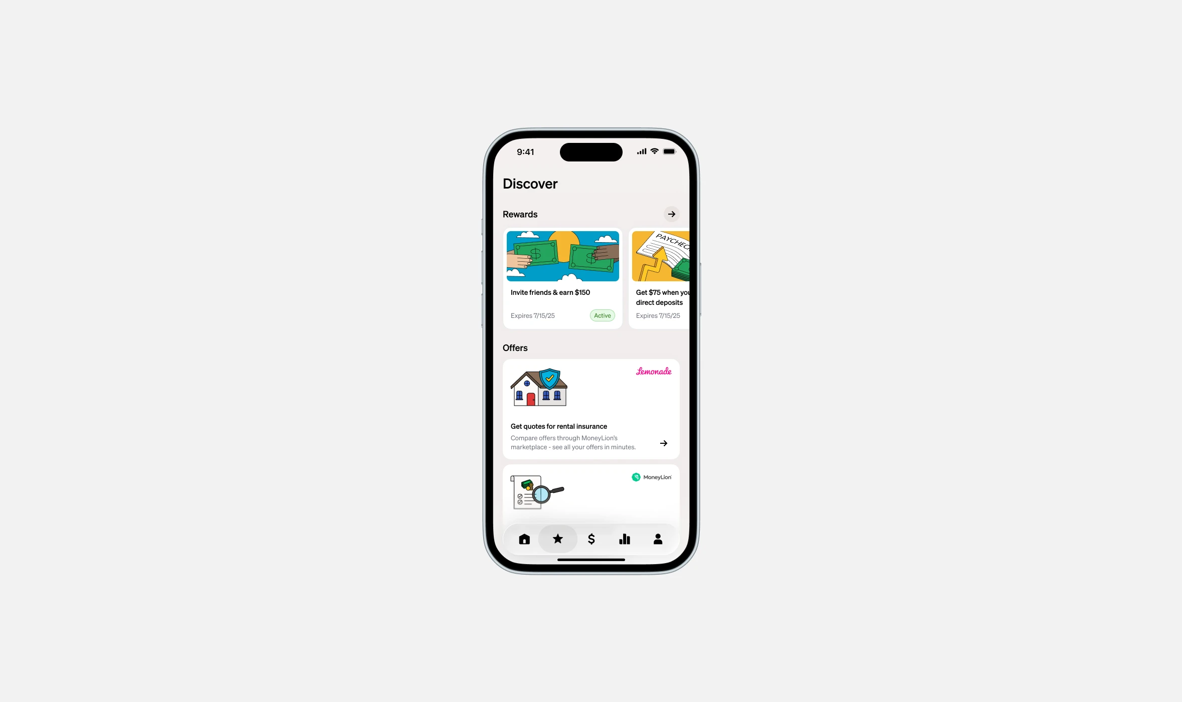
Furthermore, introducing a dedicated "Discover" tab for offers and other content would allow for improved discoverability, drive incremental app engagement and ultimately boost payroll conversion.
Rather than shocking our users with a massive overnight change, and in part due to engineering constraints and bandwidth issues, we phased the rollout to monitor risk and user sentiment.
Cleanup & Consolidation
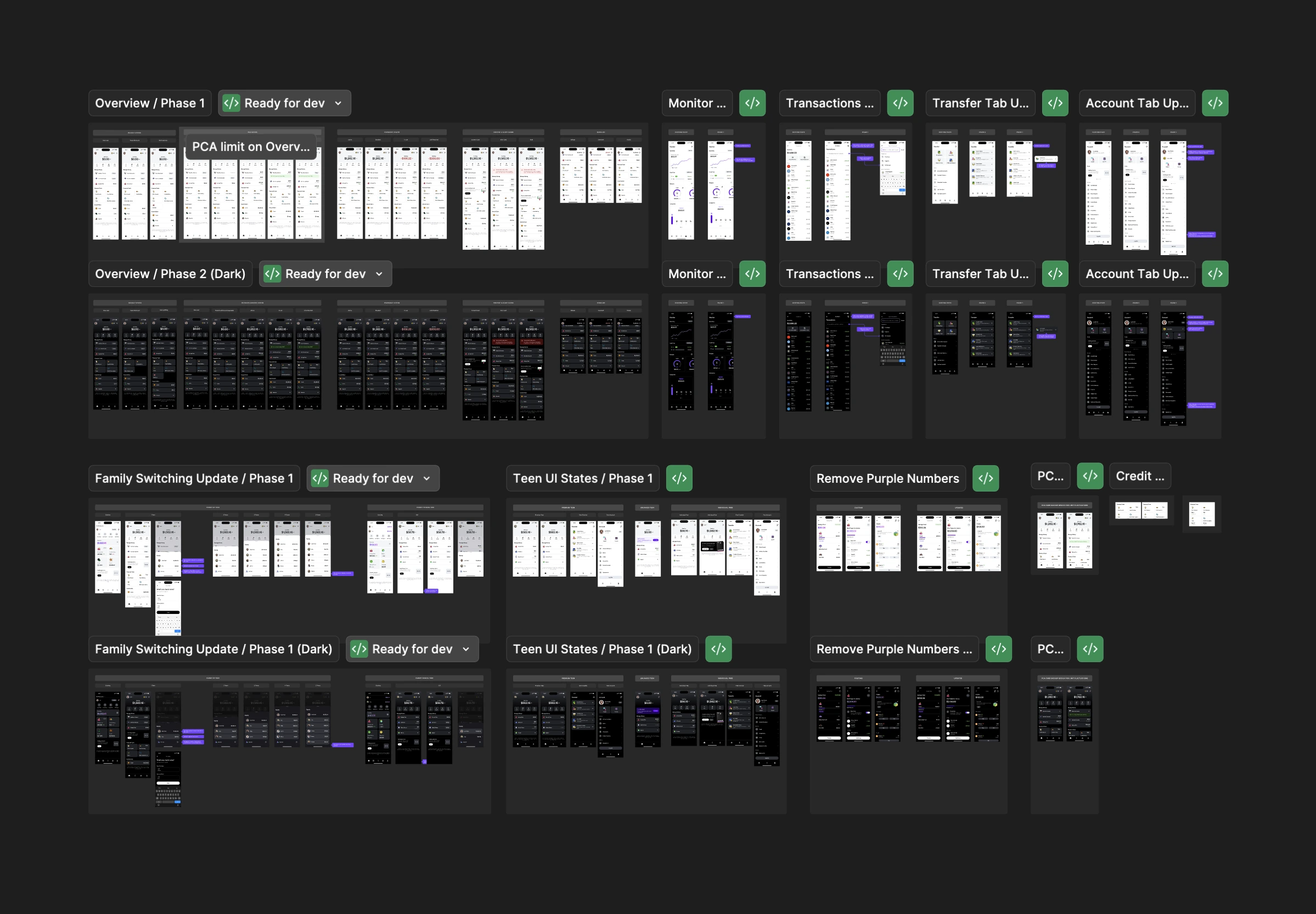
Phase 1
Stripped out duplicate entry points across the Transfer and Account tabs to reduce clutter. We decided to move to 100% immediately without a feature flag based on stakeholder agreement and research findings.
Deprecated the Services tab entirely. Rebuilt the Overview screen with new card components, an animated referral entry point, and immediate visibility into spending balances, Paycheck Advance, and Overdraft. This was rolled out to 10% for monitoring, before an eventual full release after positive sentiment and metrics.
Expansion
Phase 2
Launched the "Discover" tab to centralize always-on incentives, partnership offers, and points redemption, shifting these from comms-only channels into a native app experience.
Navigating edge cases, trade-offs, & risk
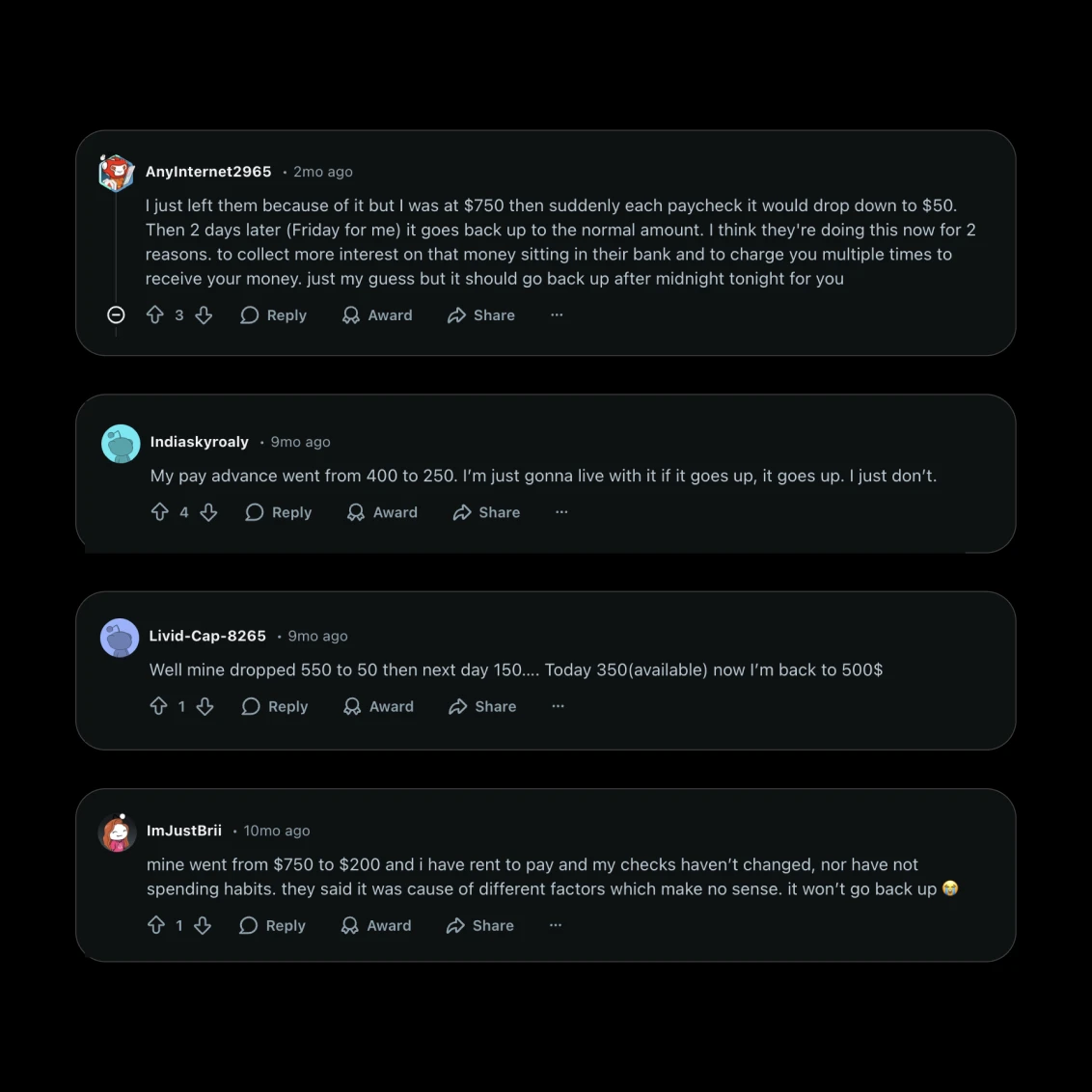
Exposing liquidity limits directly on the home screen introduced new risk, due to limit fluctuations, a known pain point for users. If a user's Paycheck Advance limit decreased, seeing that immediately upon login could trigger frustration or a spike in support tickets.
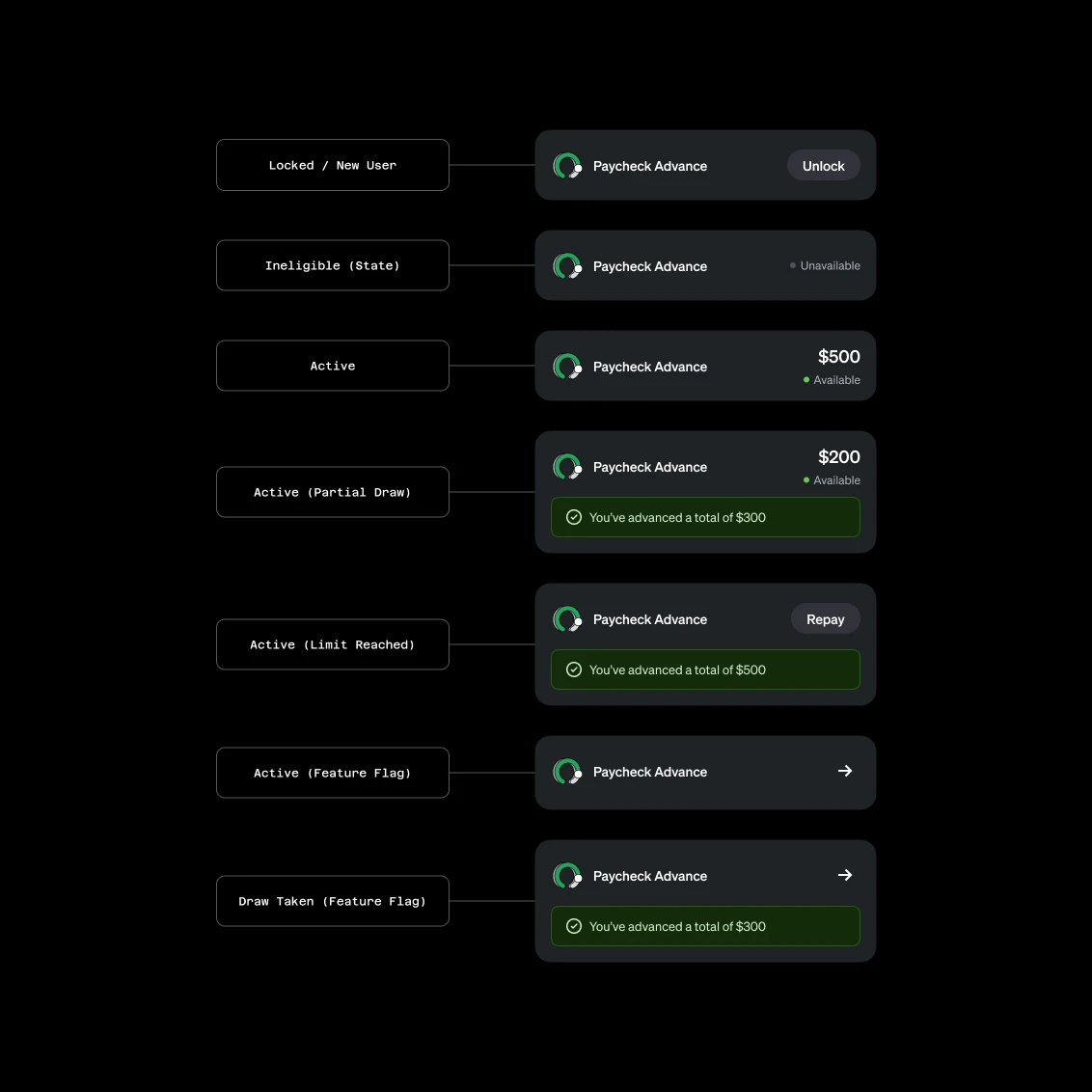
To mitigate this, I designed distinct contextual states for the UI components depending on the user's lifecycle (New, Active, Limit Reached, Ineligible (State Restriction)). We also gated the visible limits behind specific feature flags to A/B test the impact on user sentiment and inbound support volume before a full rollout.
At several points, design vision clashed with product strategy. For instance, we debated where to surface overdraft limits; while design felt it belonged in card controls for better organization, the business team pushed for the overview screen to maximize visibility of user liquidity.
Outcomes
What did we achieve?
Increase in engagement
The primary goal was increasing discoverability and clicks to high-value features without hurting business-critical metrics.
- Paycheck Advance: 14.6% increase in click-through rate, 3% increase in draws
- Overdraft: 6.9% increase in click-through rate
- Referrals: 12.4% increase in click-through rate
Small lift in payroll conversion
Increasing payroll conversion wasn't a make or break for this project, but we saw a small lift due to increased discoverability of Paycheck Advance and referrals on the homescreen.
Multiple campaigns viewed on discover
Over a month-long monitoring period, with 5 campaigns launched, we had 245k unique users visit the discover tab, with 7,342 cross-campaign users, something our old interstitial method couldn't emulate.
Dedicated portal for self service
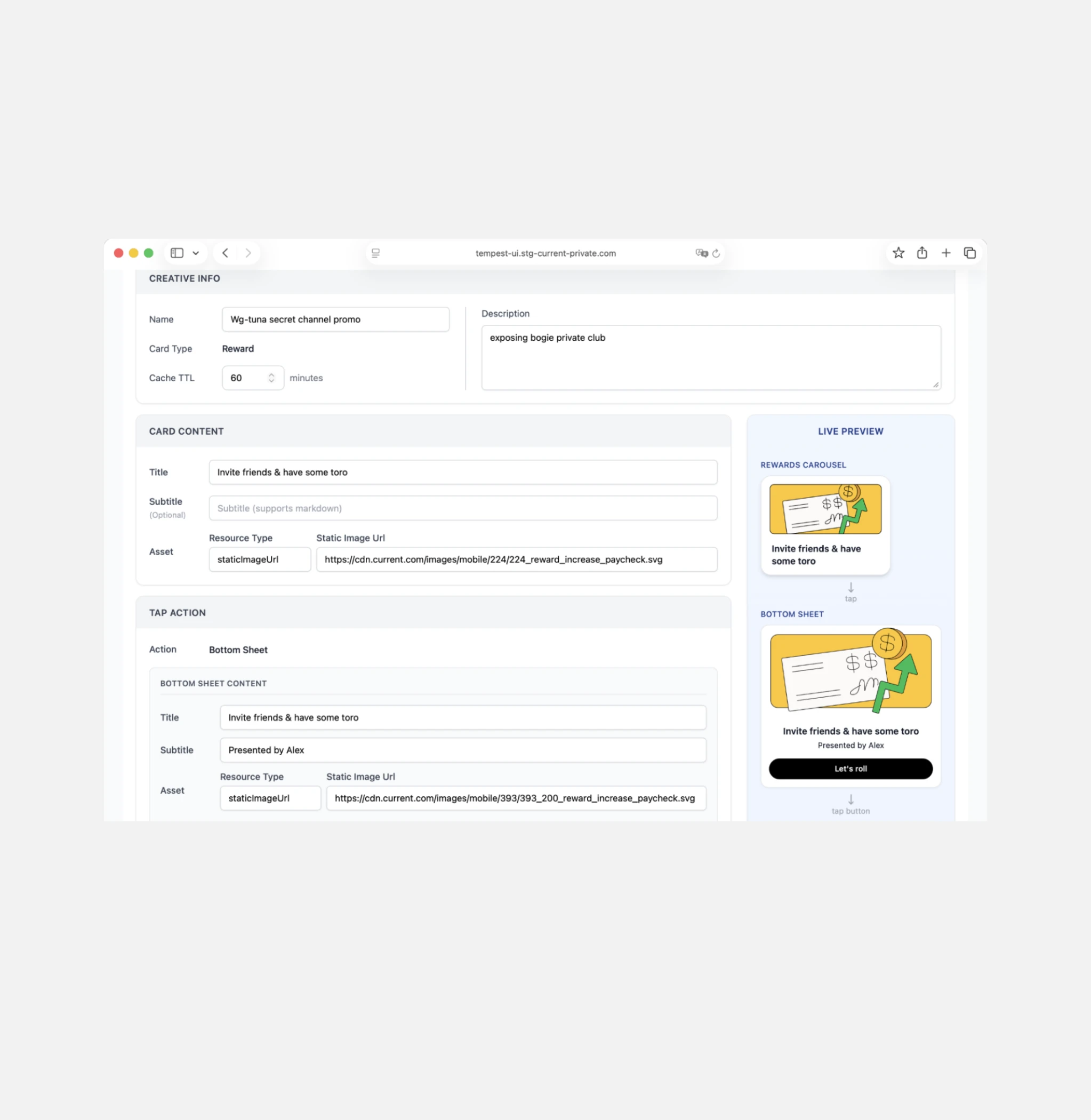
Through the completion of the discover tab, we also created a dedicated portal for PMMs to self serve campaigns on the discover tab, complete with prioritization.
Expansion
What's next?
The discover tab was originally proposed as a place to explore a range of content, and was descoped for launch to just two categories, rewards and offers. Work is underway to bring the full vision to life, including educational content, points offers and more.
A full overhaul of the monitor tab is also in the works, (a tab that hasn't seen love in over two years) with the goal of bringing more useful insights and financial information to users.
Credits
Product Design
Dan Wood
Product Management
Maggie Newcomer, Phil Shipley
Engineering
Sergiy Momot, Ramit Suri, Mingming Lang, Jayson Isaac
Data
Bella Ishmaeva
User Research
Seka Sekanwagi, Travis Pinnick